
How we made a new homepage for our choir

A presentation about what we achieved with the renewal of the Csíkszerda choir website
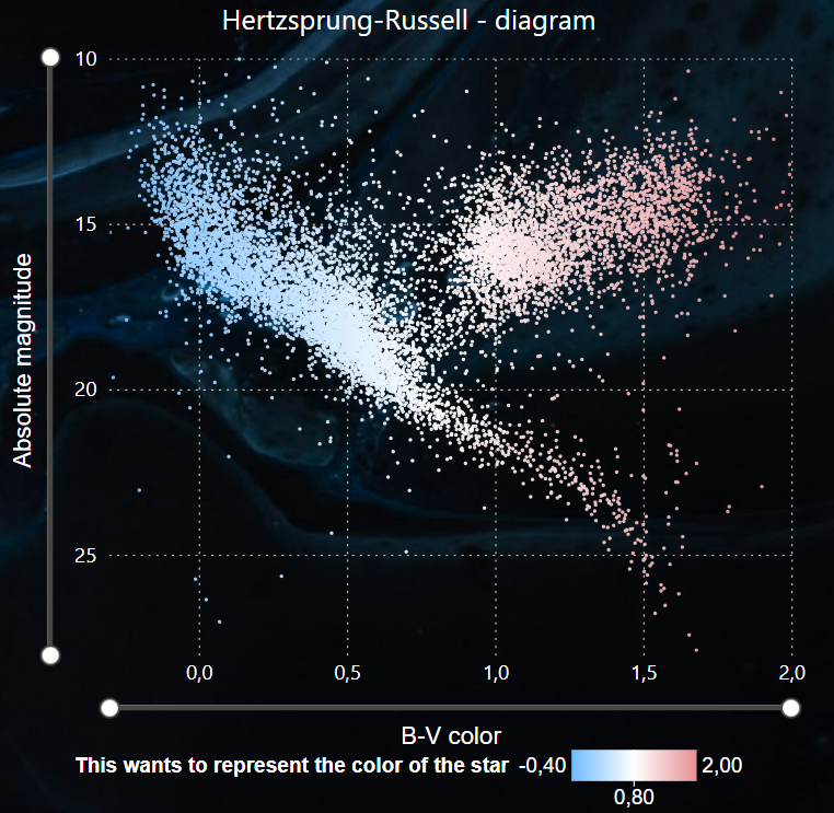
Power BI HRD
In order to achieve my long term career goals, I really need to learn how to use Power BI. Since self-study is my superpower, I added it, and to add some fun, I used astronomical data. I downloaded the Hipparchos catalog as a test, and based on the contents of the columns I realized that a Hertzsprung-Russel diagram (HRD) would be perfect for my first project. This chart, which is fundamental to astronomy, was also a great project because there were so many different things to try and learn about Power BI. However, to be honest, my initial goal was just a simple HRD, the other filters, slicers and other features were just additional ideas. I did not regret this project at all, in fact, I really enjoyed the work. My HRD HRD represents the absolute magnitude of a star as a function of its color, but before we can proceed further, I need to define both terms first. Absolute magnitude Color of a star (B-V) Anyone who has seen a starry sky has noticed that the stars appear to be of different brightness. This is the visual magnitude. However, how bright a star appears depends on many different factors: From the brightness of the star: as they are also physically different. From the distance of the star: by definition, since a star is further away, the fainter it appears. From light absorption. We had no data on light absorption, and compared to the other two factors, it affects the magnitude of the star very little. So we neglect this. If we want to know how bright the stars really are relative to each other, we have to calculate how bright they would be if they were the same distance apart. The magnitude, which would be the apparent magnitude (m) of the star at a distance of 10 parsecs, is called absolute magnitude (M). The relationship between the two quantities is in the Function 1, where d is the distance to the star in parsecs. Stars have different colors, just like light bulbs have different color temperatures. To express this, the color index (most often the B-V color index) is used in astronomy. The physical details of this are beyond the scope of this article, so let’s stick with the fact that the color indices are usually in the range between -0.5 and +2. Smaller numbers are the color index of stars with a bluer, therefore higher color temperature, while larger numbers refer to a redder color. Function 1: Relation between the apparent and absolute magnitudes. The Hipparcos catalog contained many columns. When interpreting this data, I realized that not only can I display an HRD based on the data, but later I will be able to make it more interactive and informative with slicers. Since at this point I couldn’t assess exactly what I could get out of this project, I imported most of the database columns into PowerBI. The Hipparchus catalog did contain the B-V color index, but not the absolute magnitude of the stars, only the apparent megnitude. The absolute magnitude had to be calculated, but the database also did not contain the distance of the stars. Parallax, however, does. In general, parallax is the change in the relative position of bodies at different distances, viewed from different directions. The stars appear to move minimally as the Earth revolves around the Sun, and the distance can easily be calculated from the angle of this displacement. Due to the small angular deviation, the trigonometric parts of the formula can be neglected. The relation is therefore the following: Function 2: relation between parallax and distance Once the distance has been calculated from the parallax, the absolute magnitude can also be calculated from the apparent magnitude. So we have the two physical entities required for HRD. Picture 1: HRD generated with Power BI After I tried everything related to editing HRD from a design point of view, I was already thinking about how I could make it more useful, interactive and informative. Spectral type slicer On the HRD, the different types of stars are located separately, in their specific places. Of course, stars can be grouped in several different ways, which may be interesting from our point of view. I looked through the columns of the Hipparchus catalog and to my great delight it contained the spectral type of the stars. The spectral type is essentially an identifier consisting of a few characters, the different characters of which have different meanings. The first character can typically be a letter (O, B, A, F, G, K, M, R, etc.), while the second character can be its subcategory from a data visualization point of view. So I dreamed up a two-level slicer to mark the spectral type. However, I ran into some difficulties here: The spectral type can really be very diverse. It wasn’t given for every star, there were also empty lines. There were cases where the data was enclosed in parentheses or where the second character was a “/” or “+” sign. There were cases where only the bottom character appeared, etc. So I excluded empty lines and spectral type data starting with special characters from the analysis. I suppose this is a regular complication for anyone who works with Power BI on a daily basis, but this is the first time I’ve encountered this problem. Picture 2: And here’s the slicer. In the picture, I filtered it to the G2 stars, the HRD changes dynamically accordingly. Stellar classes The stellar classification does not end with spectral types, in fact, the best part is just beginning. The Roman numeral following the first two characters of the spectral type indicates the classes of the stars, which is so interesting, and they appear so typically on the HRD that it would have been a mistake to make a three-level slicer for the spectral types. Only these Roman numerals deserved a separate button slicer. I could write about stellar evolution and star classification for an amazingly long time, but this again goes beyond the scope